/01.
Overview
StakeOne began as an early product idea inside Stake: a premium product for owning a whole property, rather than a fraction of one.
The core Stake product is built around fractional property investment. StakeOne was aimed at a different kind of investor, so it needed to look and feel distinct enough to carry that journey.
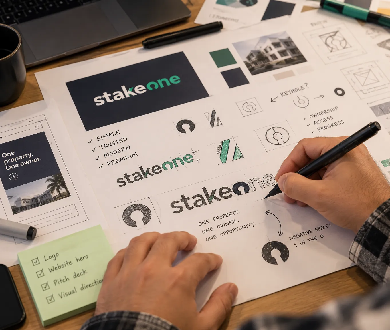
When I started, there was nothing to show anyone: no logo, no brand direction, no visual identity, no pitch deck style and no landing page. There wasn’t a brand designer to hand it to either, so I picked it up myself and took it from first logo concepts to a direction stakeholders could sign off.
/02.
Part of Stake, but its own thing
StakeOne had to feel connected to the wider Stake brand, but different enough to stand on its own.
It also had to work for a lot of people at once: higher-net-worth investors, existing Stake users ready for larger opportunities, international buyers and UAE-based property investors, as well as the internal teams and external investors evaluating the idea. And it had to happen quickly.
/03.
Putting the “1” inside “One”
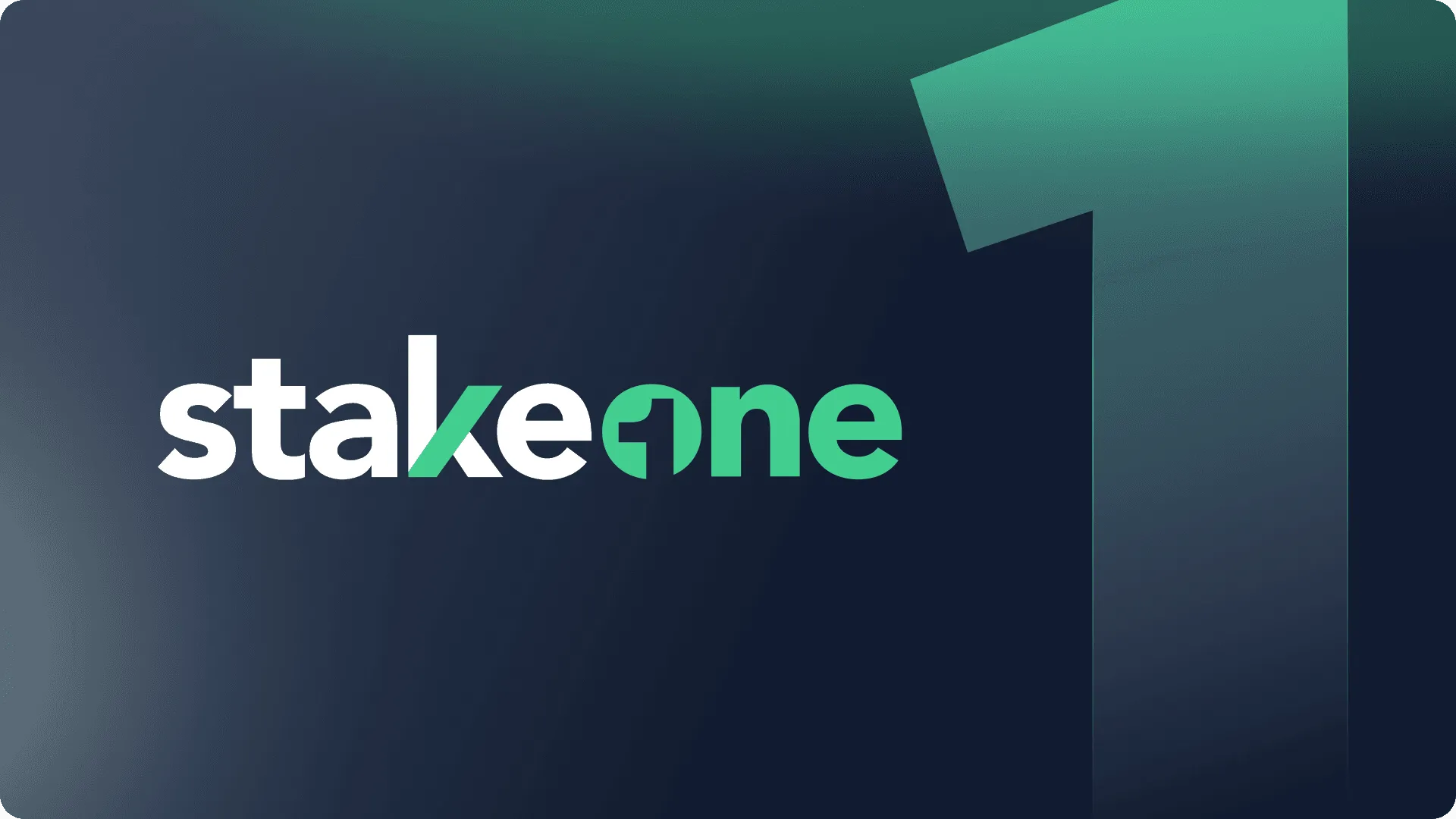
The logo concept came straight from the product: owning one whole property, rather than a fraction.
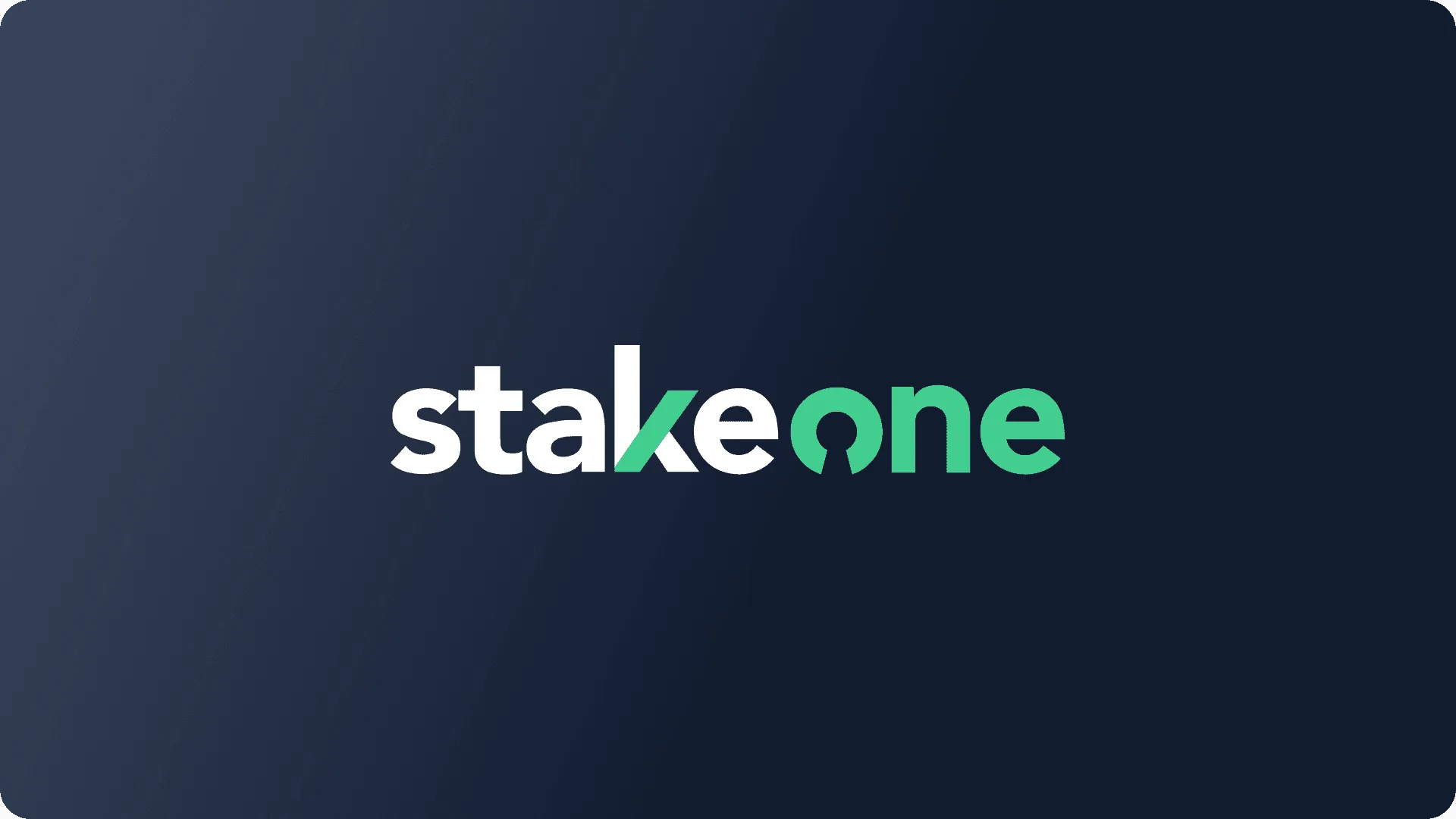
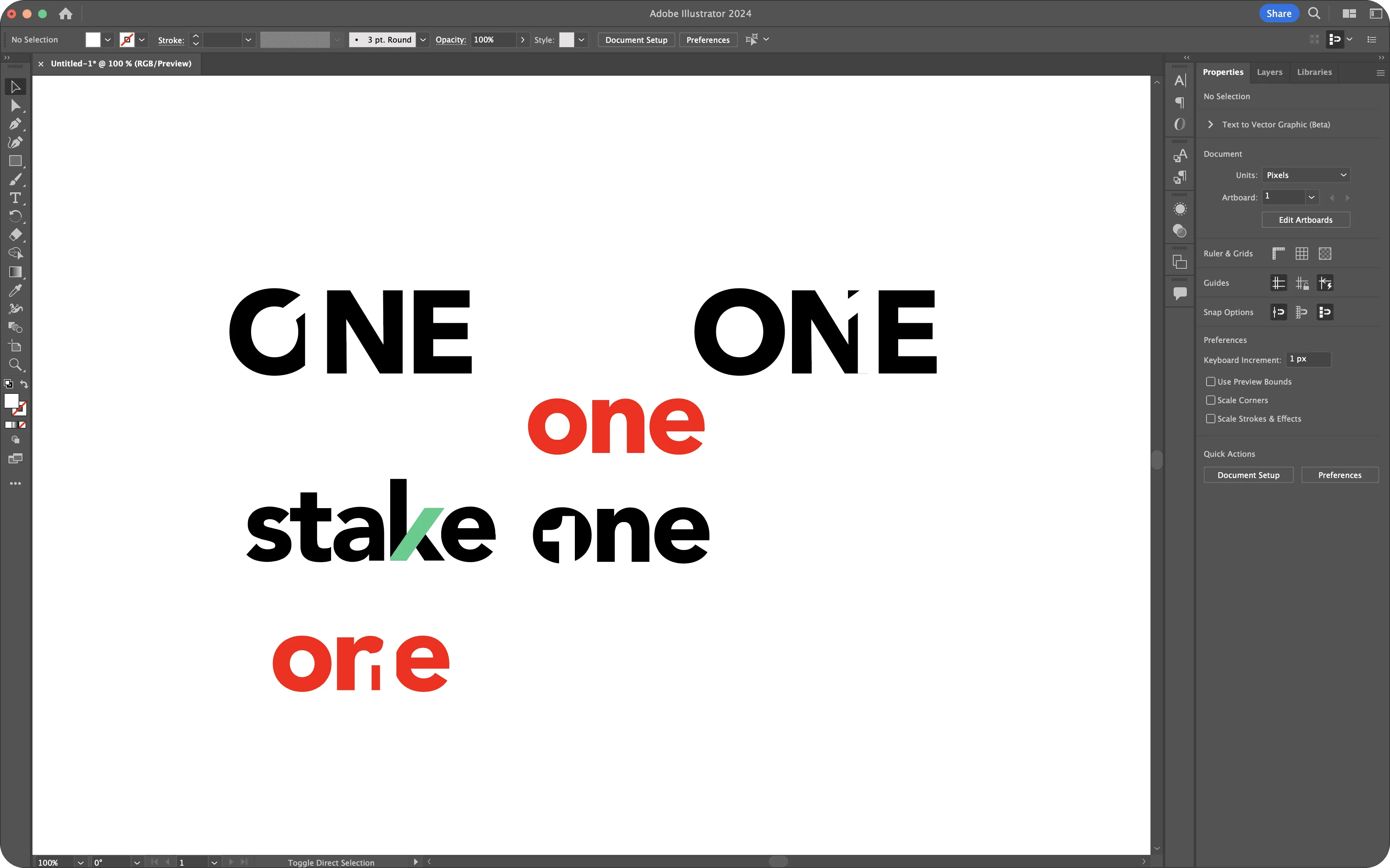
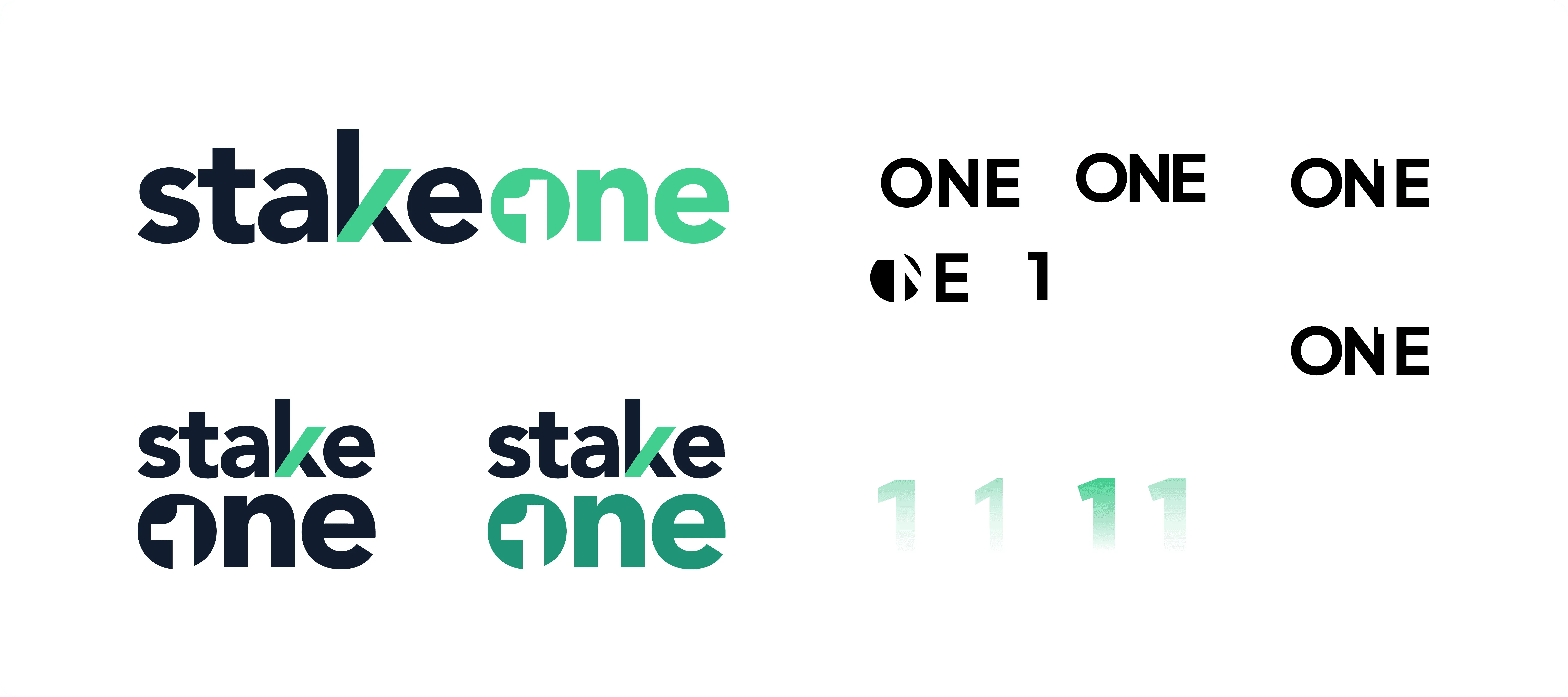
I looked for ways to bring the idea of “one” into the wordmark and landed on a negative-space approach, placing the number “1” inside the “O” of “One”. It tied the brand to the product promise:
One property.
One owner.
One premium investment opportunity.
/04.
Going darker
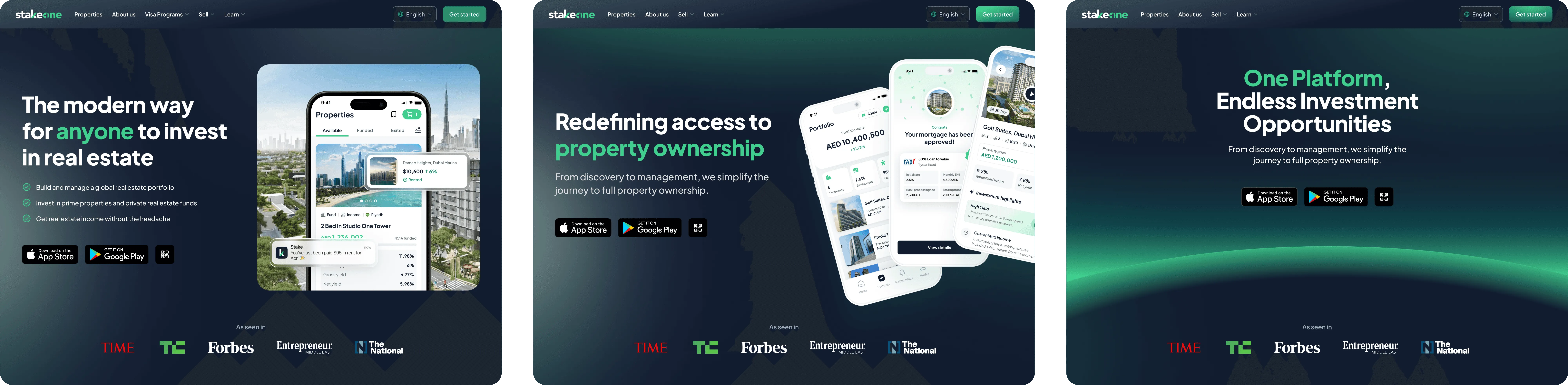
With the logo direction in place, I tested how the identity held up in context: pitch decks and presentations, title deck concepts, landing page directions and website hero explorations.
Along the way, I pushed the brand darker, with deep backgrounds, glowing gradients and bolder compositions. It made StakeOne feel more premium, which mattered for the investors it was aimed at.
/05.
Where the work ended up
The brand work made its way into the app, the waitlist page, user-facing and investor-facing marketing, and the investor pitch decks. It gave product, marketing, operations, sales and leadership the same picture of what StakeOne was, which made it easier to talk about with investors.
It also helped make the case for building the full MVP. The founders liked the direction, and the CTPO approved it.
Before launch, an external designer was brought in to refine the logo and explore more concepts before the final mark was chosen. My part was the early groundwork that helped StakeOne become real inside the business.
See StakeOne as it launched, or read the StakeOne product case study.